February 20, 2014

Shoddy With You

Every year during Reading Week, I go out with a group of friends for food and shopping (to see last year's post, click here).  This time around, I found an H&M coat ($80) worthy of mention:

What caught my eye about this coat was how it's slightly different from what I would expect to find in H&M.  Even though H&M offers a wide variety of styles, I still didn't expect to see this prim and proper trench with a lady-like bow in any setting other than a high-end boutique. So naturally, I tried it on!  And for a Red-Soled Fashionista first, I actually have a photo of myself wearing the jacket!  I know I rarely make personal appearances on this blog, and that is mainly because I didn't have a digital camera when I first started out, and in the end, I don't consider this a personal style blog.  It still isn't, but now that I've discovered how to transfer photos from my phone to my computer, I can at least give you an idea of what the things I try on look like.


I've positioned myself to present the coat in the best light (sidenote: why do change rooms always have the worst lighting?), but don't be fooled - there are many things that make this trench not worth your money. Although I grabbed a size 2, which ended up being too big on me (you can tell in the arms), my criticism of this coat has nothing to do with fit.  One of the easiest ways to distinguish a quality coat from a cheaper one is cutting.  You can't see in the photo, but the supposedly flared hem turned out to be undulating rolls of thin fabric. This trench could have benefited from a stricter cutting of the flare and thicker fabric.  The first thing I look for in coats is a structured hem, and a lot of the times, they don't manage to past this test.


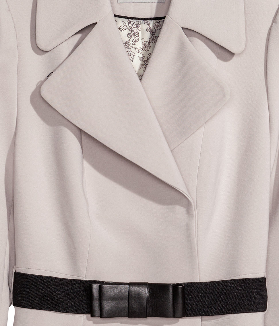
Next, this coat had press-studs/snap-fasteners that were just awful, awful, awful.  Not only are press-studs a sign of low quality, what's worse was that the outline of one of the fasteners was clearly visible beneath the, as I mentioned, thin fabric.  You can't even hide the fact you have a bad quality trenchcoat...it's now clear as day.


And if you'll allow me one last punch, the bow belt was so obviously made with fake leather (H&M even proudly calls it "imitation leather" on its website) that I had lost all faith in this trenchcoat.  But I'll soften the blow by giving H&M some props. The lapels were done perfectly, the belt accentuated my waist quite well, and the general look of the jacket itself is very chic.  I commend H&M for trying its hand at this design.

Overall, nice try H&M, but considering I see you as one of the highest quality fast fashion retailers out there, I know you could have done much better.


Note: This has nothing to do with fashion, but just want to give a huge congratulations to the Canadian women's hockey team for winning GOLD!  Couldn't be more proud of my country.

Image source: hm.com

February 18, 2014

Behind the Scenes at Red-Soled Fashionista

My friend officially started a Youtube channel yesterday (congrats!), and throughout these past couple days, has been keeping me updated on what it takes to get that first video out. I keep up with a couple of vloggers, and just seeing them sit in front of a camera and talk, I don't end up realizing how hard it actually is to vlog. Especially with the Sochi Olympics going on, the idea that true skill is making something look easy is really resonating with me right now.

Then I turned the attention to myself.  As a blogger, I play the deception game too.  There's a bit more to it than the string of words you see on the page.  So I've decided to give you a behind-the-scenes look at what it's like being Red-Soled Fashionista:

1) Inspiration


This is actually the easy part.  Every post is born from an inspiration, and that I have plenty of. Inspiration comes from something as simple as a word someone says, something I happen to glance at when I go through daily life, or something I experience. Literally anything can trigger a flood of ideas (especially when I already have so much to say about everything fashion-related), and once I'm inspired, my mind turns into an engine, pumping out sentence after sentence, which leads me to...


2) Writing


I have a bad habit, or lack thereof, of not carrying around a pen and notebook like writers do. Once my brain kicks into gear and sentences start forming in my mind, those words are lost to me forever unless I find a way of immortalizing them.  Considering my creative phase is at night when I'm in bed trying to sleep (my mind produces its best work when I'm laying there with nothing else to think of), I've lost many a good sentence by the time I wake up the next morning.  Sometimes it takes A LOT of effort and motivation to get back into the groove of a topic and bang out a solid piece of writing I'm happy with. Some unfortunate ideas have been left unwritten in my Drafts folder for years.  One day, they will surface, I promise.  But when I catch those magical moments where my laptop is right by my side during a burst of inspiration, I end up with a post I know I'll be proud of for years to come.


3) Images


I like to disperse images throughout a post to break up dense blocks of text.  This phase ranges from very simple, to very difficult.  For example, if I'm looking for an item that I tried on in a store, or a specific photo I happened to see in a magazine, it can sometimes become an incredible quest across the plains of Google Images.  Let's just say I now have a gift for choosing the best keywords to use when finding obscure images online.  Also, the process of crediting the images I use is quite tedious. That is all.


4) Editing


Writing in itself is difficult enough.  Writing in an organized, coherent manner is a marathon. And oh, don't forget adding personality and cleverness so that people actually find you interesting.  Although the writing process is easier for me since I have honed this passion for the past 5 years, the editing phase never changes. Even the best writer needs a good, heavy dose of editing.  I'm incredibly meticulous with editing (as people who have worked with me on group reports may know), and hate submitting a piece of writing until I know every letter and punctuation mark is perfect.  In this phase, there is a lot of reordering and rewording of sentences until I feel completely satisfied.


5) Title


Every post needs a good title.  While some bloggers will go for the all-caps, sensationalist titles that prey on your curiosity, and others will go all hip with a song lyric, I usually go for ones that are either informative or short and clever.  Coming up with a good title is pretty difficult, and oftentimes, I have to settle for a mediocre one for the sake of time.


6) Labels


I only started using this feature during my second year of blogging.  As my database of posts grew, I thought it would make sense to label and categorize my posts to make looking back easier.  For example, this post is labelled "Musings", and "Musings" is also where I consider some of my best posts to be located.


7) Publishing


At last.  This is when I finally let my child go, watch it navigate the vast world of cyberspace, and hope it meets some good people along the way.  There's anticipation, there's hope, and there's pure, pure happiness. As a writer, I'm addicted to the adrenaline rush of being published.

So there you have it.  My goal is to take my inspiration, infuse my passion, and hope that once I click that "Publish" button, I manage to inspire you too.  And then I do it all over again.

Image Source: Photo1, 2, 3, 4, 5, 6, 7

February 17, 2014

Christopher Kane Spring/Summer 2014 RTW

I first took notice of Christopher Kane back in Spring/Summer 2012 RTW when he came out with those, I'll admit, hideous sandals, and I have some early recollection of his space collection for Resort 2011. But Christopher Kane has never been a designer on my radar. Until now. When my fellow fashion friend (the only person I've met who I've been able to legit talk fashion with) said Kane produced her favourite collection of S/S'12, I knew it was worth checking out.

Kane's collection may seem like a mash up of different concepts, but on closer inspection, there's a very literal floral theme - or as Kane calls it, a high school biology class - running throughout.  First, it started with petal-shaped cutouts outlined in metallics and strategically positioned like a pocket, or a decorative neckline. Although some spatterings of cutouts made my skin crawl, I did appreciate their loud statement.


And then we moved on to my favourite part of the collection.  Here, we saw a more abstract interpretation of botanicals, with airy chiffon acting as petals struggling to bloom from beneath heavier white dresses.  And when they finally did bloom, it became a story of fabric innovation.  To create the frothy spray-painted pieces lined with holographic tinsel, Kane heat-pressed fabric together until they melted into one amazing confection.


The technical brilliance soon turned to more literal interpretations of budding florals, as textbook images of flower anatomy overwhelmed the models' frames, some even produced through the cutout method we saw earlier.


In my second favourite part of the show (that sweater with the embellished shoulder cutout...perfect), Kane brought out dresses with great, sweeping folds, which led way to satiny slips held down by crystal clips. Beneath every ordinary bud is a flower waiting to show its dazzling face.


At last, Kane ended by bombarding us with flowers and petals, in case we didn't quite get the message yet. It was cheeky, it was brash, it was fun.


Although a bit disjointed, Kane's fabric mastery and personality shine through from start to finish (crocodile clips?  Only Kane.)  And oh, he knows how to make killer sweaters all the hippest girls will surely have their eyes on.  As this collection confirms, Kane is like that underground designer who only those in the loop are aware of, but who is silently heading the new frontier of fashion.

Watch the entire show here.

Image Source: Style.com

February 1, 2014

Fix Me, Please

I had debated whether I wanted to write this post.  Lena Dunham for Vogue...it's not along the lines of what I usually blog about.  I never bother with celebrity fashion, and I don't often cover controversial topics (mainly because there are always two sides to a coin, and respecting those who don't share your opinion is a key quality many people seem to forget when typing fuming, accusatory comments online).  However, on the topic of photoshopping in the fashion industry, there's something very interesting about Dunham's situation that captured my attention over the usual photoshopping scandals.


So the story is this: Dunham's images for Vogue February 2014 were released, and Jezebel, a women's blog, offered $10,000 for the unretouched versions of the images. Within two hours of the bounty, six unaltered photos were received.  The kicker is the photos turned out to be not that heavily photoshopped, and fire has actually come under Jezebel for offering such an amount of money for images they thought would be shockingly different.  As the critics say, Jezebel has merely succeeded in implying they thought Dunham's actual body would be less attractive. I like to think how funny it would be if the unnamed source behind the unretouched images was Anna Wintour herself, who pocketed the pretty $10,000 and is snickering in her office as we speak.


Looking at these GIFs, however, I want to address something other than Jezebel.  We've all seen those photoshop videos and images where an "average" girl is digitally transformed into a glowing goddess, so much so that sometimes I just want to throw my hands up and say, "All right!  I get it!" What's funny is how these dramatic photoshop before-and-afters have lost their effect.  We all know the fashion industry favours tiny waists, long legs, sharp faces and impossibly smooth, flawless skin. Does that really stop us from wanting to look like that gorgeous model on the cover?  No, because a size 0 figure is so desirable editors are willing to cut inches off a model in order to achieve it.


Dunham's before-and-afters, on the other hand, are different.  Here we see adjustments to lighting, clothing, and posture.  The puckered shoulder on the cover photo is evened out. The sagging wide-neck on her dress is brought up and tightened.  The waistline of the coat is lifted to give better shape, while the legs peeking out are repositioned to heighten the glamour. You might not agree with all of these adjustments, but all in all, these are fairly mundane changes.  Sure, her hunched neck has been straightened, her chin defined and her eyebags removed, but is this different from posing and filtering yourself in your Instagram selfies?  If you were going to be featured on the cover of Vogue - the bible of the industry - wouldn't you want to look your best?  Based on Dunham's reaction to this whole incident, seems like she doesn't mind looking her best. The main point here is that Vogue has featured a different body shape in its issue, and lo and behold, with minimal touch up.


While those dramatic photoshop transformations have never really affected me, it's these minor adjustments to Dunham's photos that truly help me realize perfection is futile. I look at fashion images and envy how the clothing always fits perfectly on the body, yet when I try the pieces on in stores, there are lumps, wrinkles, and bunches in all the wrong places. Looking at Dunham's photos, turns out high fashion pieces lump, wrinkle, and bunch during photoshoots too.  I used to envy how models and celebrities were always perfectly positioned in photos and managed to achieve such high glamour. Why can't I look as glamorous just standing there?  Turns out a little fixing of posture can hide the fact models don't get their poses right from head to toe all the time either.  Thanks to Dunham's photos, I can finally fully accept that as stunning as fashion images are, in reality, they start with a model standing against a dim background with her neckline sagging as she attempts to find the best angle, yet may not manage to achieve it.

How peculiar it is that exposing heavily photoshopped images has less of an impact than simply revealing the amount of effort we're willing to put into erasing the minor inconveniences of life.  Fashion images are meant to bring us to a heightened dimension of fantasy (and goodness, we can't have a dress sagging in fantasyland!), and that's why photo editing will never go out of practice, but it's nice to know that behind every flawless image, there was an ordinary, mundane reality.

Image Source: Jezebel